 |
| This was the opening to the kitchen before we took down the wall. |
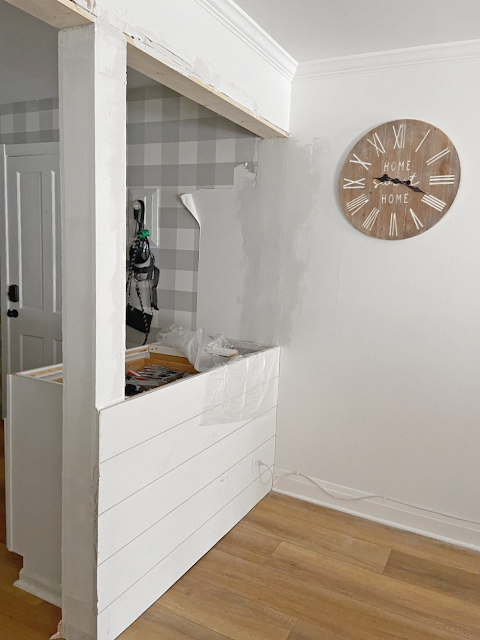 |
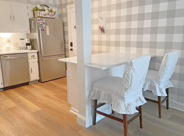
| After we took the wall out we put shiplap on the back of the two cabinets that were going to be the new island. |
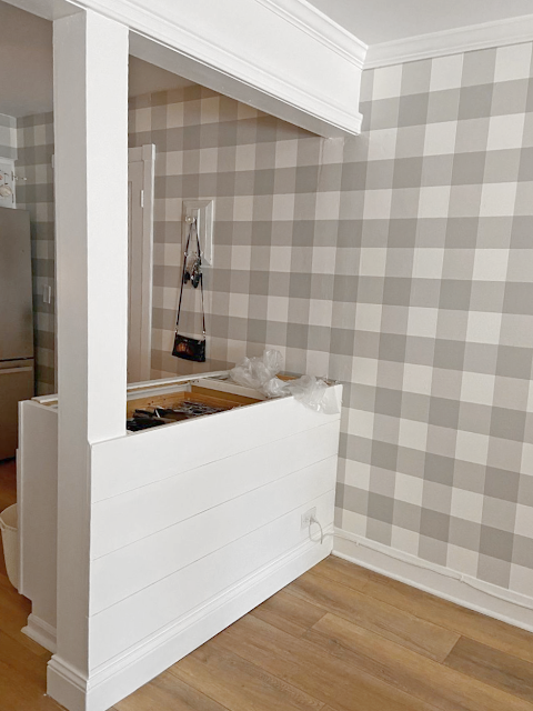 |
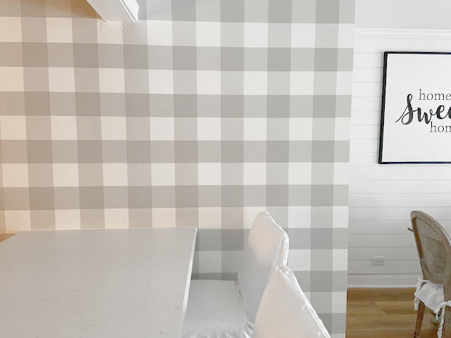
| We painted the shiplap all the base moldings and trim then painted them all white. We finished the wall with continuing the wallpaper. |
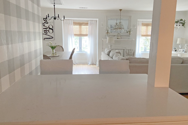 |
| Even on this cloudy day you can see how opening this wall brings in more light and feels more open concept. |
 |
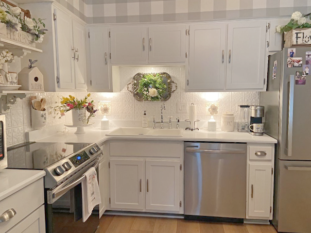
| This is the quartz counter tops. They are white with small veins of light gray. I wanted a very subtle pattern. |
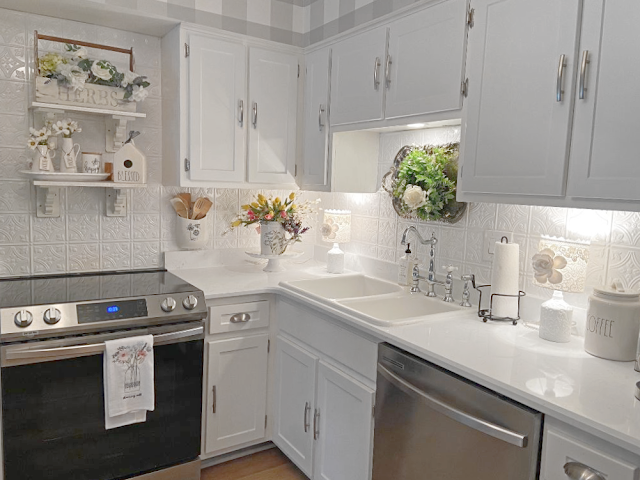 |
| I love the subtle design to the counter tops. The gray picks up my appliances and hardware color. |




.png)


.png)
.png)
%20(1).png)


That turned out great! It does make the kitchen a lot brighter.
ReplyDeleteLove the island and the backsplash, both look amazing.
ReplyDeleteAmazing Kris. It looks so beautiful! All the details are just perfect and I love the warmth your touches of gray add to the room. It really makes the white and you appliances pop! Enjoy your light and bright room!! xoxo
ReplyDeleteI love the partial open concept to the kitchen Kris. I love the pretty wallpaper and the counter is great and I know you will love it. I hope you enjoy the weekend Kris.
ReplyDeleteWhat a wonderful outcome! Your kitchen looks delightful and so open! It'll be perfect for entertaining! I've always loved your white, and that wallpaper is just charming! Your entire home decor is truly lovely. You've got great taste and a great eye for decorating, my friend!
ReplyDeleteHugs,
Nancy
Looks great, Kris. Can't wait for the bling. xo Laura
ReplyDeleteWOW, so pretty!!!! I LOVE the new countertops!!!!
ReplyDelete~Des
What a difference that one change made. It really opens it up. I love everything about your beautiful kitchen. And I love, love, love that wallpaper. Good luck finding something to add to that wall space. That's where the fun comes in, am I right?
ReplyDeleteGosh Kris! It looks amazing and so full of light too. In fact it's hard to remember now just how dark the original kitchen looked. The Junk Chic Team have done another incredible makeover. How wonderful for you to be going shopping knowing that you have got that wall to shop for! Look out Terry! Happy shopping Kris! xoxo
ReplyDeleteThe most beautiful kitchen I have ever seen!
ReplyDeleteThis is so amazing. The changes you've made to this condo have made it SO much more attractive and up-to-date, Kris. I like how you've extended the wallpaper and created the sitting area at the bar, it's perfect. That counternis very similar to waht we have in our kitchen. I'm sure some great treasure(s) will find you when you go to Michigan that'll give that wall exactly what you're wanting.
ReplyDeleteKRIS! Wow, you guys did it! That one change really did make a huge difference by letting in that much more light but giving you more surface space on the island top! Very nicely done, as always my friend!!! And I hope you have a fun trip to Michigan, going into your favorite shoppe. We went to Excelsior, a cute town on the shores of Lake Minnetonka yesterday. It was magical. Antique shoppes, good bistros and the houses? Amazing.
ReplyDeleteThe countertops make a wonderful difference! I have no doubt you will find something special for that large wall and we will all say, "why did we think of that?". Enjoy your week! xoxo
ReplyDeleteKris it looks amazing! Those are my dream counters right there. I still have formica (does anyone even knw what that is!) at least it is white but it has wood trim. Yuck. I like the clean of white, so soft and welcoming. Good job!!! (hubby too!)
ReplyDeleteMorning Kris, Love the way this came out, and love that you carried the wall paper on, it really looks pretty. I think it looks great the way it is....I would just decorate the new area with the wallpaper and leave the post as is... or paint it the color of the grey
ReplyDeletein the wallpaper maybe. I think it looks very clean and neat and really looks great.
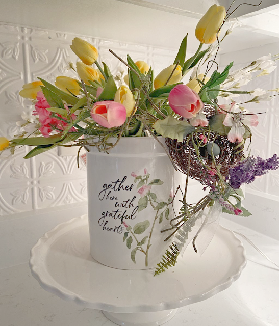
Also loved your floral arrangement at the beginning of the post, very pretty.
Enjoy......You guys did it again.....
Have a lovely Sunday,
Blessings, Nellie
This is gorgeous Kris! The light you get is so pretty. The wallpaper is so pretty too. The island will be perfect for big gatherings.
ReplyDeleteI know you will find fantastic pieces in Michigan
The kitchen looks great, Kris. Love what you've done, and can't wait to see what you come up with for the column and the big wall. I know it will be fabulous! Hugs.
ReplyDeleteSo pretty Kris, the counter tops look amazing. Such a beautiful transformation. The island looks so pretty and a perfect place to entertain. Love the open concept look. I know in no time, you will find the perfect piece for your wallpaper wall. Xoxo
ReplyDeleteWhat a beautiful final reveal!!! Your choices keeping things light and bright and opening up that wall---all awesome ideas! I LOVE how your kitchen has come together. Great eye Kris as usual!! Thanks for sharing!
ReplyDeletePerfection Kris. You guys did a fabulous job as always. Having more light makes the room look so much larger AND accessible. Love the countertops, it's all so pretty and fresh. And oh that wallpaper is wonderful!
ReplyDeleteIt's beautiful, Kris! Looks like it comes from the pages of a magazine!
ReplyDeleteBrenda
Love it all. Beautiful kitchen.
ReplyDeleteThis turned out so beautifully! That's my favorite countertop pattern! Y'all have made so many lovely changes to your condo and really made it your own! Perfect!
ReplyDeleteThe new counters are gorgeous and I really like what you did with the island! It's such a nice bright light filled space. Just my opinion but I wouldn't do anything to draw attention to the post. Instead, I would hang a large chippy framed sign/wall art directly above the island counter to finish the look.
ReplyDeleteI always say that you and Terry are amazing when it comes to re-do's. This one is no exception. Absolutely amazing!
ReplyDeleteIt looks fabulous, Kris!!! I like the dark wood of the stools. The contrast is nice.
ReplyDeleteYour countertops are so very nice dear Kris. As is your home. You are a wonderful decorator. GIRL....you could have a side business easy if you wanted one! I must tell you that I had a sweet chuckle looking at the pictures on your frig. LOOKS like mine! What sweet faces to gaze upon daily. Hugs and blessings, Cindy
ReplyDeleteKris, I absolutely love it. What a difference ! I love all the light, and your wallpaper is so pretty.
ReplyDeleteKris,
ReplyDeleteIt looks so lovely!! The wall paper, the chairs with covers on them, and the whole effect is so charming!! Love it!!
Hugs,
Deb
Oh my goodness Kris! This turned out so wonderfully and really does open everything up. You & Terry always have such great style vision. Jane
ReplyDeleteKris, it looks fantastic! I love the clean, sleek look of the counters, and what vision you had to create the island. I don't doubt for a second that you won't find some bling for your wall - you have such an eye, and always find perfect pieces!
ReplyDeleteKris, this is an amazing transformation.I love the quartz countertops. This opened up your space so wonderfully and the light is amazing. Enjoy your week!
ReplyDeleteWOW! Bright, clean and home sweet home. I love it! Well done. :-)
ReplyDeleteSuccess! I love the way it turned out, Kris. Flowers are gorgeous as well.
ReplyDeleteAmalia
xo
Great job. I really like the shiplap..I have never used any of that..looks nice. Yall will really get a lot of use out of the countertop, I bet. :0) As always..stylish and so very pretty. Thanks for sharing..Have a great Summer and good luck hunting for more special treasure.
ReplyDeleteKris, I just love it. What a difference it is all making. I can see how it feels so open and inviting. Love the wallpaper too. I know you will find just the right thing for the wall..Hope you are well and enjoying the thought of summer..Happy Wednesday..xxoJudy
ReplyDeleteSuch a gorgeous improvement! That wallpaper is so cool. And I LOVE that countertop. I just love your kitchen and can't wait to see what you do with that wall. ;)
ReplyDeleteKris!! I am planning a trip to Michigan this summer and I would love (and appreciate) a list of your favorite shopping haunts.
ReplyDeleteI do not have an email for you so if you email me I would be happy to give you a list of the shops in Michigan. xoxo Kris
DeleteWow! the kitchen looks wonderful, Kris! LOVE the wallpaper! It's been so long since I've seen your place! You never cease to amaze me. Love all the bright light streaming in. xx..
ReplyDeleteThat looks amazing! I love that wallpaper too. Great choices!! xoxox
ReplyDeleteHi Kris, I was checking to make sure I hadn’t missed a post. I know I commented on your beautiful and light-filled kitchen. It is amazing the difference! Please check spam to see if my comment went there.
ReplyDeleteWhat a pretty kitchen - adore your wallpaper and the basket about your sink....your new counter is perfect for serving food - enjoy Michigan!
ReplyDeleteKris, You have worked pure magic in your pretty Kitchen. I always enjoy seeing your transformations. Love, love this wallpaper! Enjoy your weekend! Hugs, Jemma
ReplyDeleteLove how this turned out, Kris! It feels open and airy and bright! Look how the new counters shine too! Oh shucks, you have to go shopping to find something for your wall. Lol. Have fun!
ReplyDeleteHugs, Cecilia
Oh my goodness beautiful and open i am so jelly about it lol
ReplyDeleteNice post thank you Sarah
ReplyDelete