

 |
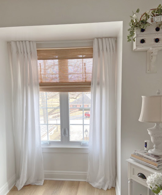
| These are my curtains and bamboo shades. I am aiming toward bringing in a little color and a print. Below you will see some of my sample fabrics. |
 |
| I am looking at gray and blue or tan/cream and gray or staying with my white and tan and maybe new drapes like the picture below. |
 |
| I love this inspiration picture from Teri at Simply French Market on Etsy. Then I could keep my bamboo shades. |
 |
| This is one with a pretty blue background and gray and white in the floral print. |
 |
| This one has a off white background with tan/cream and gray. It is hard to see the light tan color in the flowers but it would match pretty nice with my bamboo roman shades. |
 |
| This is white background with light blue, darker blue and gray flowers. |
 |
| This one has a pretty blue background and some gray in the flowers. |
 |
| This has a darker blue background with gray and white in the flowers. |
 |
| This one has a lighter background in sky blue and pretty blue and gray flowers. |
 |
| This one is actually the nicest fabric. It matches my couches the best too and I think I can keep my roman shades. I have so many good choices to pick. I hate that I cannot narrow it down to just one. I have been hanging them on the curtains so I can see the fabric in the light of day and at night. So far they all look good. Ugh!!! The question is do I go with a print and some color or do I stick with my farmhouse white and creams and do up the Simply French Market drapes and add white ruffle pillows to my couches. I hope to be back soon with what I decide. I love that I have a Southern Exposure in the two windows so the light is always bright and pretty. This condo has been the best for staying neutral with my whites, creams with how much light comes in this room. I just have been thinking about a cottage print and maybe a spot of color. I know all you color fans will like that choice but I have to really think about this. I wish it could be an easy choice but it is not. Have a great Friday and weekend. Hugs, Kris |


.png)
.png)
.png)


.png)


Lovely choices! Which one makes you happiest to look at? I think I would pick the tan/cream one. It has a quietness that fits that spot. Good luck picking!
ReplyDeleteFor what it's worth, I love your white curtains and bamboo shades. I am in the opposite predicament right now: tired of my print curtains and wanting cream-colored ones! Remember with print curtains, it's harder to decorate around them. Just a thought: could you bring in some print pillows instead, if you are wanting some color and pattern?
ReplyDeleteI know whatever you decide, it will be beautiful - you have good taste!
Oh my goodness, they are all beautiful, I'd have a really hard time choosing, too. I know whatever you choose will be perfect. Can't wait to see what that is!! xxoo
ReplyDeleteHi Kris! I am afraid I won't be much help - I really !like all of your choices, lol. Maybe get them all and change them monthly, lol! Curtains are hard for me. Looking forward to seeing what you pick!
ReplyDeleteokay this is just me, but I'd go with the cream/tan floral. It would look pretty with the wood shades, give you a print, but still work with any color choice you might want to use. All the fabrics are gorgeous, but I get tired of any one certain colorful print and start wanting to change things up. The cream/tan floral mixes it up but doesn't lock you in to one certain color. just me... love those curtains for your inspiration! have a good weekend! xoxo
ReplyDeleteI'm glad I'm not the one who has to make the final decision because they're all beautiful. I was a little more partial to the tan/cream and gray though.
ReplyDeleteThese kinds of choices are so hard for me once it's down to the several you have. My picks were yours exactly, if you go with pattern. But then I read your reasons and the fact you have southern exposure, I think you should keep the Roman shades. Maybe that helps narrow the choices, lol. Doubt it. Have a great weekend.
ReplyDeleteHello Kris!!! WOW!!!! You do have some decisions to make as I think all of them are just beautiful. Blue is my go-to color for spring and all of these add that fresh spring look. I also like the ruffled white drape. If you want to add color I wonder, could you simply add some small vases to your window sill with pretty "forever flowers" in blue, pink and yellow?
ReplyDeleteI actually think your second and second to last choices would be good. They have the softness of what I think about your style. Neither seem too busy. My favorite is your last choice but then I love bright. The French Market version with ruffles are so you. And they would look good in your space. It's hard to decide sometimes. If you're able, try one with color. You can always change them out later.
ReplyDeleteHugs, Cecilia
I like the first one with the blue background. It's very romantic. I'd use that fabric for some pillows. The white curtains are just so beautiful! Good luck and have fun!
ReplyDeleteKris, all of them are really pretty. I love blue, so I always lean to patterns with blue. I would definitely keep the bamboo shades, they add wonderful texture. Have a wonderful weekend!
ReplyDeleteWell, you didn't ask our opinions but you know we are all going to chip in! I think you can keep your bamboo shades with any option you pick. I have had bamboo shades for years and my curtains have never had tan in them to match. My favorite is the first one you shared, but then again I love color!
ReplyDeleteSomeone mentioned it is hard to decorate around print curtains, but it is not. I have no problem at all mixing patterns as long as the scale is right and they all share the come color.
ReplyDeleteWhatever you choose will be beautiful! All the fabrics are pretty but there is something to be said for choosing a neutral print.
ReplyDeleteEnjoy your weekend! We had a fabulous week but cooler, more spring like temps are coming in. I take all the sunshine offered! xoxo
Morning Kris,
ReplyDeleteAll the fabrics are beautiful but to me the very last one with the white background and the simple floral look most like you, I think. You have all the colors in there too, but it's just doesn't take over but seems that it would definitely stand out and lend you some color without overdoing it, and that's great you could keep your shades as well. Hope you figure it out soon, it is hard to imagine sometimes what the finished product will look like sometimes. Have a lovely weekend hon, Blessings for a good choice, Nellie
I really like the blue and white selections. They are classic colors and will last you a long time. Happy selecting!
ReplyDeleteI LOVE the curtains from Teri at Simply French Market!!! SO BEAUTIFUL!!!! In my opinion, there is nothing like a crisp, white curtain hanging at a window with soft sunlight filtering through! I would go with some pillows to bring in a little color! They are so easy to switch up with a different color when you're tired of them.....simply change the cover! My house is decorated in mostly white just like yours, Kris! I have a white couch, white curtains, white walls...etc. I change up my pillow covers with each season change. It gives my living room just the pop of color it needs without having to redo the whole room to get some color in. Makes for easier decorating because I can go with any color that suits my fancy! I know you'll make the right choice that's right for you!
ReplyDeleteNo matter what you choose, it will be perfect, Kris. Dare I mention that I have spray painted bamboo shades in the past? LOL- Of course, you lose the 'natural' look by doing that.
ReplyDeleteI love the plain white ones you have up now but it would be fun to see a bit of color there, too. Good luck choosing.
Have a wonderful weekend. xo Diana
I am a blue girl and I love the last one. It would be lovely adding a soft touch of colour. Hope you finally succeed in choosing one. Goo luck!
ReplyDeleteI like all of the floral selections you have but I love the second photo of the tan/cream/gray so it would go with the bamboo shade. I also like what you have up now. I can't wait to see what you choose.
ReplyDeleteI hope you have a nice weekend Kris.
Hi Kris! UK Fairy Curtain here, reporting for duty! Lol!
ReplyDeleteKnowing you, as I have come to do over the years, I would say the tan,cream and gray. It would compliment everything so beautifully, especially with your bamboo shades. Curtains are a major expense - so my thinking is that this is a safer option. You could bring in various bits of blue, but in smaller things - maybe a cushion (sorry, would you call them pillows?) or two and other decorative pieces which you could change around maybe? Whatever you finally choose will look wonderful, because your taste is so very good xoxo
I like Melanie's idea of using the fabrics on pillows, and keeping the curtains as they are ~
ReplyDeleteI don't know if this will help, but I would go with the insporation photo and add ruffles to a white or cream drape. I think it goes well with your style and would give you just enough of the change you are looking for. Good luck.
ReplyDeletePamela
I like the last one because of the light background. It's not an overwhelming print. Plus a couple of pillows would give you a touch of color. Good luck. Whatever you choose will be beautiful!
ReplyDeleteKris, I think any of them would look lovely. In your last home, you added the blue and white florals and they look wonderful. I think all of them would look great with your roman shades because it is a neutral color. Follow your heart. did Terry have some input? Have a wonderful weekend. xoxo
ReplyDeleteThey're all pretty. I like the ones with blue flowers and light backgrounds.
ReplyDeleteBrenda
I just love blue.. so this would be hard for me too, they are all so lovely.
ReplyDeleteI am looking forward to seeing what you decide.
xx oo
Ooh well I like the last one best. It not too much color just enough!
ReplyDeleteKris I love them all. However I love the very first blue one with white & gray flowers. The Design 9312826. Can I ask who the designer or manufacturer is of that print? I would love to purchase fabric to make pillows for my home. I adore your style. Good luck with your decision.
ReplyDeleteHi Kris,
DeleteHope you come back to read this. I do not have anyway to email you since you are a no reply on comments. If you go to Spoonflower.com and put in the design number it will come up for you. Hope this helps. xoxo Kris
They are all pretty, Kris, but I can see how it's a tough decision. Any of them would make beautiful curtains. Maybe the ones with the white backgrounds would be safest. Or, try adding color in smaller ways, like pillows or other accessories. I know whatever decision you make, it will be gorgeous! You have the knack!
ReplyDeleteYou have so many great choices. You'll pick out something great
ReplyDeleteDid Terry give you an opinion?
I love those swatches, especially top right. Those types of material make me so happy. Who would thing you could get high on fabric swatches!
ReplyDeleteHi, Kris. I'm trying to remember, you have two windows in that room? Perhaps, having drapes going to the opposite sides, one pulling to the left in one window one to the right in the other. This would give you maximum light and also limit the amount of print. In the past you have often shied away from 'too much' when you have introduced a print. Adding on one side of the window might really work?
ReplyDeleteHugs, Sandi. PS all the prints are gorgeous! Sorry, I'm no help there.